


Want to encourage more customers to visit your website? You might argue that having a stunning layout and images would attract more customers, but even if you create a beautiful page, visitors would back out if it isn’t a mobile-friendly website.
Not surprisingly, mobile-friendliness became a crucial ranking factor in Google’s search engine. Sites that could not deliver premium experiences for mobile users dropped in Google’s ranking. So if you want to generate traffic, you need to prioritize mobile-friendliness.
Now, how can you become a mobile-friendly site? How can you attract mobile users? We’ve compiled useful tips to help you get started.
1. Find Site Speed Issues
Google found that 53% of mobile site visitors will likely leave a page that takes longer than three seconds to load.
As page load time increases from one to seven seconds, the likelihood that a mobile site visitor will bounce off the page increases to 113%.
How to speed up your site? You can find site speed issues with the free Google Pagespeed Insights tool.
PageSpeed Insights can analyze the contents of your website, discover problems and provide personalised suggestions to speed up a page. To get started, place your website’s address in the search bar.
Google will grade your website in terms of performance, accessibility, best practices and SEO.

Next, it will compare your site against other competitors.

The opportunities section provides tips on how to improve performance. Users can find suggestions and opportunities that they can take advantage of to speed up their website.
The free tool can even generate separate results for desktop and mobile devices. It’s highly recommended that you optimize your site across the multiple channels that customers will use.

2. Pick a Reliable Web Host for a mobile friendly website
Mobile websites need a reliable web host to get it up and running.
For starters, the most important factors when choosing web hosts are uptime and load time. Uptime refers to the duration of time that a server is up and running. Having a 99.9% uptime means that the site is running 24/7.
A slight downtime could have big costs for your business.
In fact, 98% of organizations found that a single hour of hosting downtime can cost their business a whopping $100,000! A one-second delay can result in a 7% decrease in conversions and a 16% decrease in customer satisfaction.
That said, a good tip is to pick a reliable web host. While there are hundreds of web hosting sites across the world, a few have managed to stand out from the crowd. Whogohost has one of the best web hosting services in the world and it boasts of thousands of clients across different industries. You can visit www.whogohost.com to get your domain and hosting services.
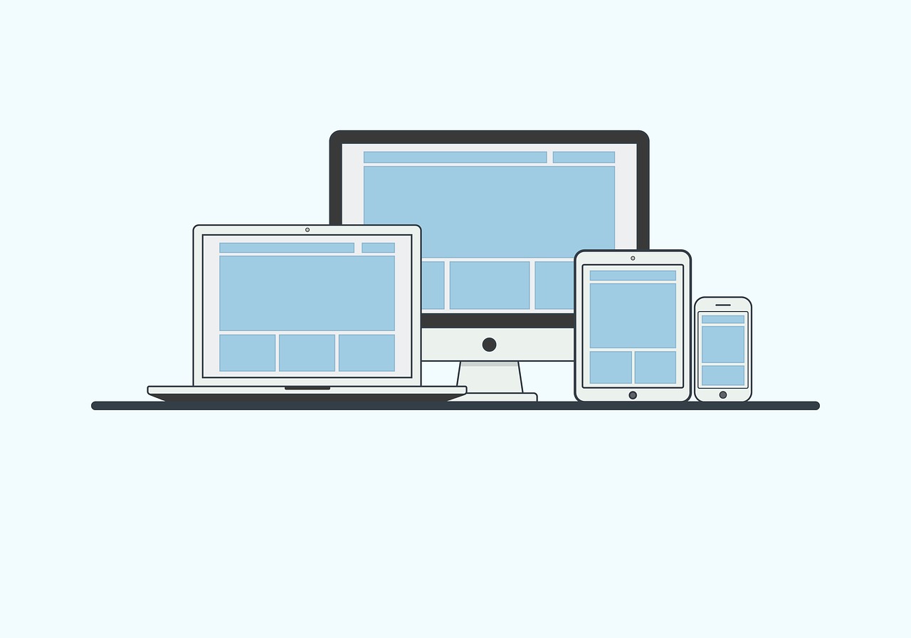
3. Responsive Design
Many mobile web designers have consistently emphasized the importance of responsive design, but why is this important?
Responsive design involves the use of flexible layouts and images on your website that can automatically respond to the device that a customer is using.
This usually involves a change in three aspects:
- Platform
- Orientation
- Screen Size
Web design is responsive when both mobile and desktop users can easily navigate around the site. The text is readable, the images load fast and the layout easily adjusts based on the user’s screen size.
If the website is not responsive, some may face difficulties in clicking CTA buttons. Images could even be disorganized and scattered across the screen. This could have a negative impact on a customer’s shopping experience, which will have a drastic effect on your site’s profits.
An eConsultancy website also highlighted brands that increased their conversion rates through responsive design. Bench increased their conversion rates by 100% while State Farm increased it by 56%.
It doesn’t take rocket science to achieve a responsive design. You can easily find themes with incredible page speed for your Shopify store or WordPress site.
Here are some listicles to check out:
- 40 Fastest Loading WordPress Themes for Incredible Page Speed 2020
- 15 FREE and Paid Shopify Themes That Loads Crazily Fast [Updated]
- Top 7 Fastest WordPress Themes
Once you’ve made a choice, check the live preview and find an updated copy of the theme. Test the preview page on Google PageSpeed Insights to you can determine page speed and get suggestions for improvement.
4. Mobile Optimization via AMP
A lot of people use mobile devices to visit websites.
In 2019, 80% of users used a mobile device to search the internet. Meanwhile, 80% of customers used their mobile device to find price comparisons, product reviews and store locations.
One way you can optimize for mobile search is to leverage Accelerated Mobile Pages (AMP). This is a web component framework that lets users create optimised pages for mobile web browsing and enable websites to load faster.
Thanks to the accessibility of smartphones, more people have used their phones to access eCommerce stores. In fact, there are 5.19 billion unique mobile phone users in the world. If your site isn’t optimized for mobile, then you’re turning away a lot of potential customers.
eCommerce Shopify stores can generate AMP pages easily with RocketAmp and FireAMP apps. These apps can load your sites instantly so you can get more sales in the long-term.
You can check out Google’s website to find out how you can create your first AMP pages and follow the Google Search guidelines for AMP pages.
5. Optimize Images
We all want to have high-quality images on our mobile website to give users a good first impression, but they can put a big load on your website.
In fact, Kinsta reports that images contribute a 21% chunk to a website’s weight. Images with a big size or resolution can have a big impact on your site’s speed.
To optimize images, you need to pay attention to file format and compression.
According to Kinsta, there are two main types of compression:
- Lossy. This filter eliminates some data. It can reduce image quality so pay attention to how much the image declines.
- Lossless. This filter compresses the data. This involves reducing the size of an image without sacrificing the image’s quality.
There are also two main file types for images:
- PNG. While these have high quality, they also possess a large file size. It uses a lossless optimization, but it could be lossy.
- JPEG. Uses lossless and lossy optimisation. This format is usually the de facto for the web because it can be compressed by a lot.
If having a high-quality image is crucial to your mobile website, then consider PNG files and lossless compression. Those who are willing to sacrifice a slight image quality can opt for JPEG files with lossless compression.
Note that using lossless compression does not mean a huge decline in the image’s quality. You can control how much the data will be compressed. This means you can have the best of both worlds—a compressed image that has quality.
Here is a list of tools that can help you compress an image:
6. Find Broken Links and Faulty Redirects
Avoid broken links and faulty redirects at all costs! Here are some ways that they can impact your mobile website:
Broken Links
A broken link is a website link that is not working anymore. This leads to users being directed to a 404 error page.
You might’ve encountered broken links a few times, and we bet that you probably left the website. While these may seem harmless, a broken link can have a negative impact on your search rankings, profits and user experience.
Fortunately, you can easily use the W3C Broken Link tool to check whether your website has any broken links.

Faulty Redirects
Having separate sites for mobile and desktop users could also lead to faulty redirects.
Mobile users should be redirected to the corresponding page in the mobile site. Ideally, it should be the same for desktop users.
In theory, it doesn’t seem like a big issue, but it can have a big impact on a mobile user’s experience. A mobile user redirected to a desktop page may have trouble scrolling and read from their small screen. They may have to zoom in and scroll the page to understand the information.

7. Reduce the Number of Apps Installed
Many eCommerce merchants run their online stores with the help of third-party apps.
If there are 20+ apps installed in your store, then you’re probably not using them all. You might’ve tried them once and just let them be. Unfortunately, each app has CSS/Javascript files running in the background which could drastically slow down your mobile website.
So, whenever you find a new app, consider its added value on mobile page load time.
Check out the list of apps installed on your website. If there are some apps that you don’t need anymore, remove them. You can even run page speed tests through PageSpeed Insights to find out its impact on your Shopify store.
How Will You Create a Mobile-Friendly Website?
Site speed is a crucial factor in your website.
Customers want to access the information in a flash. A slight delay, even if it’s only a few seconds, can have a negative impact on a user’s experience and Google rankings.
The good news is there are a lot of ways you can speed up your website. Avoid faulty redirects and use a reliable web hosting service. Leverage AMP for mobile optimization and compress your images.
How are you planning to create a mobile-friendly website? Let us know in the comments.


